The MenuNav Node Plugin makes it easy to transform existing list-based markup into traditional, drop down navigational menus that are both accessible and easy to customize, and only require a small set of dependencies. The MenuNav Node Plugin features:
- Progressive Enhancement
- The MenuNav Node Plugin is designed to support Progressive Enhancement, making it easy to transform simple, semantic markup into dynamic drop-down menus with just a few lines of JavaScript.
- Small footprint
- The MenuNav Node Plugin has a small footprint of ~5 KB (GZIP'd) and requires a minimal set of dependencies.
- Accessibility & Usability Minded
- The MenuNav Node Plugin was built with both accessibility and usability in mind. The MenuNav Node Plugin implements established mouse and keyboard interaction patterns to deliver a user experience that is both familiar and easy to use. To that foundation the MenuNav Node plugin adds support for screen readers through the use of the WAI-ARIA Roles and States.
- Easy to style and configure
- The MenuNav Node Plugin is easy to configure. The visual presentation of menus is controlled completely via CSS. A handful of straightforward configuration attributes can be used to make common modifications to a menu's behavior.
<iframe>Shim for IE 6-
No menuing system would be complete without an
<iframe>to prevent<select>elements from poking through menus in IE 6.
Getting Started
To include the source files for MenuNav Node Plugin and its dependencies, first load the YUI seed file if you haven't already loaded it.
<script src="http://yui.yahooapis.com/3.8.0/build/yui/yui-min.js"></script>
Next, create a new YUI instance for your application and populate it with the
modules you need by specifying them as arguments to the YUI().use() method.
YUI will automatically load any dependencies required by the modules you
specify.
<script>
// Create a new YUI instance and populate it with the required modules.
YUI().use('node-menunav', function (Y) {
    // MenuNav Node Plugin is available and ready for use. Add implementation
    // code here.
});
</script>
For more information on creating YUI instances and on the
use() method, see the
documentation for the YUI Global Object.
Note: be sure to add the yui3-skin-sam classname to the
page's <body> element or to a parent element of the widget in order to apply
the default CSS skin. See Understanding Skinning.
<body class="yui3-skin-sam"> <!-- You need this skin class -->
Basic Setup
To create a menu using the MenuNav Node Plugin, start by including the required markup. The markup
for menus created using the MenuNav Node Plugin follows the same pattern established for Widgets,
with each menu's content box containing one or more <ul> elements:
Menu Markup Example
<div id="menu-1" class="yui3-menu"><!-- Bounding box -->
    <div class="yui3-menu-content"><!-- Content box -->
        <ul>
            <!-- Menu items -->
        </ul>
    </div>
</div>
Menu items also follow the Widget markup pattern, with the root node defined using an
<li> element:
MenuItem Markup Example
<li class="yui3-menuitem"><!-- Bounding box -->
    <a class="yui3-menuitem-content" href="http://www.yahoo.com"><!-- Content box -->
    Yahoo!
    </a>
</li>
Submenus are defined by wrapping the the menu markup in an <li> element. Each
submenu must have have a label. The label should preceed the menu markup, and the label's
href attribute should be set to the point to the id of its corresponding submenu.
Submenu Markup Example
<li>
    <a class="yui3-menu-label" href="#submenu-1">Submenu Label</a><!-- Menu label -->
    <div id="submenu-1" class="yui3-menu"><!-- Bounding box -->
        <div class="yui3-menu-content"><!-- Content box -->
            <ul>
                <!-- Menu items -->
            </ul>
        </div>
    </div>
</li>
Following the patterns illustrated above, the markup for a menu created using the MenuNav Node Plugin comes together as follows:
<div id="menu-1" class="yui3-menu"><!-- Root menu bounding box -->
    <div class="yui3-menu-content"><!-- Root menu content box -->
        <ul>
            <li class="yui3-menuitem"><!-- Menuitem bounding box -->
                <a class="yui3-menuitem-content" href="http://www.yahoo.com"><!-- Menuitem content box -->
                Yahoo!
                </a>
            </li>
            <li>
                <a class="yui3-menu-label" href="#pim">PIM</a><!-- Submenu label -->
                <div id="pim" class="yui3-menu"><!-- Submenu bounding box -->
                    <div class="yui3-menu-content"><!-- Submenu content box -->
                        <ul>
                            <li class="yui3-menuitem">
                                <a class="yui3-menuitem-content" href="http://mail.yahoo.com">Yahoo! Mail</a>
                            </li>
                            <li class="yui3-menuitem">
                                <a class="yui3-menuitem-content" href="http://addressbook.yahoo.com">Yahoo! Address Book</a>
                            </li>
                            <li class="yui3-menuitem">
                                <a class="yui3-menuitem-content" href="http://calendar.yahoo.com">Yahoo! Calendar</a>
                            </li>
                            <li class="yui3-menuitem">
                                <a class="yui3-menuitem-content" href="http://notepad.yahoo.com">Yahoo! Notepad</a>
                            </li>
                        </ul>
                    </div>
                </div>
            </li>
        </ul>
    </div>
</div>
With the markup for the menu in place, simply get a Node reference for the root menu and then call
the plug method, passing in a reference to the MenuNav Node Plugin.
//    Call the "use" method, passing in "node-menunav".  This will load the
//    script and CSS for the MenuNav Node Plugin and all of the required
//    dependencies.

YUI().use("node-menunav", function(Y) {

    //    Use the "contentready" event to initialize the menu when the subtree of
    //    element representing the root menu (<div id="menu-1">) is ready to
    //    be scripted.

    Y.on("contentready", function () {

        //    The scope of the callback will be a Node instance representing
        //    the root menu (<div id="menu-1">).  Therefore, since "this"
        //    represents a Node instance, it is possible to just call "this.plug"
        //    passing in a reference to the MenuNav Node Plugin.

        this.plug(Y.Plugin.NodeMenuNav);

    }, "#menu-1");

});
Using the MenuNav Node Plugin
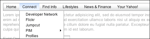
Orientation, Style and Behavior
Configuring Orientation
The root menu of menus built using the MenuNav Node Plugin can have a verical or horizontal
orientation. The default orientation for menus is vertical, but can be easily switched to
horizontal by applying a class of yui3-menu-horizontal to the node representing the
root menu's bounding box, as illustrated in the following example:
<div id="menu-1" class="yui3-menu yui3-menu-horizontal"><!-- Bounding box -->
    <div class="yui3-menu-content"><!-- Content box -->
        <ul>
            <!-- Menu items -->
        </ul>
    </div>
</div>
Once the yui3-menu-horizontal class name is applied to the node representing the
root menu's bounding box, the menu's keyboard interaction is automatically adjusted for a
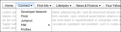
horizontal orientation. The default "Sam" skin provides the following default visualization for
horizontal menus, as illustrated in the follow screen capture of a horizontal menu example:
Configuring Style & Behavior
The default "Sam" skin provides two additional visualizations for horizontal menus, each of which can be applied by both changes to the menu label markup and through the application of a class to the node representing the root menu's bounding box.
Menu Button Visualization
The first of the two optional horizontal menu visualizations available with the "Sam" skin renders each menu label as a menu button; each menu label is rendered with an arrow to the right of its text label, providing a visual cue that there is a corresponding submenu.
To apply this style to a horizontal menu, start by adding the class yui3-menubuttonnav
to the node representing the root menu's bounding box, as illustrated in the following example:
<div id="menu-1" class="yui3-menu yui3-menu-horizontal yui3-menubuttonnav"><!-- Bounding box -->
    <div class="yui3-menu-content"><!-- Content box -->
        <ul>
            <!-- Menu items -->
        </ul>
    </div>
</div>
Next, wrap the text node of each menu label in an <em> element:
<div id="menu-1" class="yui3-menu yui3-menu-horizontal yui3-menubuttonnav"><!-- Bounding box -->
    <div class="yui3-menu-content"><!-- Content box -->
        <ul>

            <li>
                <a class="yui3-menu-label" href="#submenu-1"><em>Submenu Label</em></a>
                <div id="submenu-1" class="yui3-menu">
                    <div class="yui3-menu-content">

                        <!-- submenu content -->

                    </div>
                </div>
            </li>

        </ul>
    </div>
</div>
As a final, optional step, use the
autoSubmenuDisplay
and mouseOutHideDelay
configuration attributes to configure the menu labels to behave like menu buttons. Set the
autoSubmenuDisplay to false, so that each menu label's submenu isn't
made visible until the label is clicked. Set the mouseOutHideDelay to
0 so that a label's submenu is only hidden when the user mouses down on an area
outside of the submenu.
//    Call the "use" method, passing in "node-menunav".  This will load the
//    script and CSS for the MenuNav Node Plugin and all of the required
//    dependencies.

YUI().use("node-menunav", function(Y) {

    //    Use the "contentready" event to initialize the menu when the subtree of
    //    element representing the root menu (<div id="menu-1">) is ready to
    //    be scripted.

    Y.on("contentready", function () {

        //    The scope of the callback will be a Node instance representing
        //    the root menu (<div id="menu-1">).  Therefore, since "this"
        //    represents a Node instance, it is possible to just call "this.plug"
        //    passing in a reference to the MenuNav Node Plugin.

        this.plug(Y.Plugin.NodeMenuNav, { autoSubmenuDisplay: false, mouseOutHideDelay: 0 });

    }, "#menu-1");

});
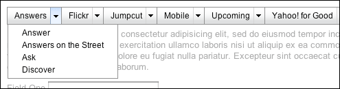
Split Button Visualization
The other optional horizontal menu visualization available with the "Sam" skin renders each menu label as a split button.
To apply this style to a horizontal menu, start by adding the class
yui3-splitbuttonnav to the node representing the root menu's bounding box, as
illustrated in the following example:
<div id="menu-1" class="yui3-menu yui3-menu-horizontal yui3-splitbuttonnav"><!-- Bounding box -->
    <div class="yui3-menu-content"><!-- Content box -->
        <ul>
            <!-- Menu items -->
        </ul>
    </div>
</div>
Next, define the markup for each menu label. Start with a <span> with a class
of yui3-menu-label applied. Inside the <span>, place two
<a> elements — one for each of the label's two clickable regions.
Each <a> has separate, but related responsibilities: The first
<a> represents the label's default action. The second <a>
toggles the display of a submenu whose content contains other options related to, or in the same
category as the default action. Therefore to configure the first <a>,
simply set its href attribute to any URL. For the second <a>,
apply a class name of yui3-menu-toggle, and set the value of the href
attribute to the id of the label's corresponding submenu. Lastly, the text node of the second
<a> should label the contents of its corresponding submenu.
<div id="menu-1" class="yui3-menu yui3-menu-horizontal yui3-splitbuttonnav"><!-- Bounding box -->
<div class="yui3-menu-content"><!-- Content box -->
<ul>
<li>
<span class="yui3-menu-label"><!-- menu label root node -->
<a href="http://answers.yahoo.com">Answers</a><!-- menu label default action -->
<a href="#answers-options" class="yui3-menu-toggle">Answers Options</a><!-- menu label submenu toggle -->
</span>
<div id="answers-options" class="yui3-menu">
<div class="yui3-menu-content">
<ul>
<li class="yui3-menuitem"><a class="yui3-menuitem-content" href="http://answers.yahoo.com/dir/">Answer</a></li>
<li class="yui3-menuitem"><a class="yui3-menuitem-content" href="http://answersonthestreet.yahoo.com/">Answers on the Street</a></li>
<li class="yui3-menuitem"><a class="yui3-menuitem-content" href="http://answers.yahoo.com/question/;_ylt=Av3Nt22Mr7YNs651NWFv8YUPzKIX;_ylv=3?link=ask">Ask</a></li>
<li class="yui3-menuitem"><a class="yui3-menuitem-content" href="http://answers.yahoo.com/dir/;_ylt=Aqp_jJlsYDP7urcq2WGC6HBJxQt.;_ylv=3?link=over&amp;more=y">Discover</a></li>
</ul>
</div>
</div>
</li>
</ul>
</div>
</div>
Use the autoSubmenuDisplay
and mouseOutHideDelay
configuration attributes to configure the menu labels to behave like split buttons. Set the
autoSubmenuDisplay to false, so that each menu label's submenu isn't
made visible until the menu trigger is clicked. Set the mouseOutHideDelay to
0 so that a label's submenu is only hidden when the user mouses down on an area
outside of the submenu.
//    Call the "use" method, passing in "node-menunav".  This will load the
//    script and CSS for the MenuNav Node Plugin and all of the required
//    dependencies.

YUI().use("node-menunav", function(Y) {

    //    Use the "contentready" event to initialize the menu when the subtree of
    //    element representing the root menu (<div id="menu-1">) is ready to
    //    be scripted.

    Y.on("contentready", function () {

        //    The scope of the callback will be a Node instance representing
        //    the root menu (<div id="menu-1">).  Therefore, since "this"
        //    represents a Node instance, it is possible to just call "this.plug"
        //    passing in a reference to the MenuNav Node Plugin.

        this.plug(Y.Plugin.NodeMenuNav, { autoSubmenuDisplay: false, mouseOutHideDelay: 0 });

    }, "#menu-1");

});
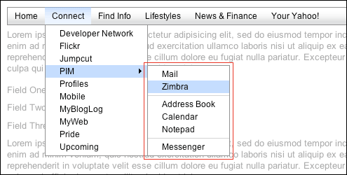
MenuItem Separators
The MenuNav Node Plugin makes it easy to create separators between items in a menu.
To separate items in a menu, simply place items in their own
<ul> elements inside their parent menu's content box, and
apply a class name of first-of-type to the first
<ul>. The following code will render separators between
the "Zimbra" and "Address Book" items, and the "Notepad" and "Messenger" items.
<div id="pim" class="yui3-menu">
    <div class="yui3-menu-content">

        <ul class="first-of-type">
            <li class="yui3-menuitem"><a class="yui3-menuitem-content" href="http://mail.yahoo.com">Mail</a></li>
            <li class="yui3-menuitem"><a class="yui3-menuitem-content" href="http://www.zimbra.com">Zimbra</a></li>
        </ul>

        <ul>
            <li class="yui3-menuitem"><a class="yui3-menuitem-content" href="http://addressbook.yahoo.com">Address Book</a></li>
            <li class="yui3-menuitem"><a class="yui3-menuitem-content" href="http://calendar.yahoo.com">Calendar</a></li>
            <li class="yui3-menuitem"><a class="yui3-menuitem-content" href="http://notepad.yahoo.com">Notepad</a></li>
        </ul>

        <ul>
            <li class="yui3-menuitem"><a class="yui3-menuitem-content" href="http://messenger.yahoo.com">Messenger</a></li>
        </ul>

    </div>
</div>
With the separator markup in place, the default "Sam" skin will render a top border between each
<ul> element, as illustrated in the following screen capture of one of the
MenuNav Node Plugin examples:
Styling State
The MenuNav Node Plugin manages the state of a menu's descendants through the application and
removal of class names. Class names representing state are constructed using the descendent's
name followed by a suffix representing the state. For example, hidden submenus have a class of
yui3-menu-hidden. Class names used to represent state are always applied to the
descendant's root node. See the CSS reference for the complete list of state class
names.
Active vs. Inactive
Menuitems and menu labels have a default (inactive) state and an active state. Menuitems and
menu labels are considered active when the user is interacting with them via the keyboard or the
mouse. The active class name applied to menuitems and menu labels has two benefits: It provides
a single entry point for styling state that would otherwise require the use of multiple CSS
pseudo classes (:hover and :focus). The second benefit to the use of
the active class name is that it provides consistent styling of state across all types of elements in
all supported browsers.
(IE 6 only supports the :hover and :focus pseudo classes on
<a> elements. And while IE 7 supports :hover on all elements, it
only supports :focus pseudo class on <a> elements.)
Visible vs. Hidden
By default all submenus are hidden and that state is reflected by the application of the
yui3-menu-hidden class name. If the yui3-menu-hidden class name is not
applied to the bounding box node of all submenus, it will automatically be applied by the MenuNav's
constructor. When a submenu is visible, the yui3-menu-hidden class name is removed
and a class yui3-menu-label-menuvisible is applied to the submenu's corresponding label.
Configuration Attributes
The MenuNav Node Plugin has several configuration attributes that can be set via an object literal
that is passed as a second argument to a Node instance's
plug method. (Note: These
attributes are case sensitive.) In the following example, the value of the
mouseOutHideDelay attribute is set to 1000.
var oMenuNav = Y.one("#productsandservices");
oMenuNav.plug(Y.Plugin.NodeMenuNav, { mouseOutHideDelay: 1000 });
The complete list of the MenuNav Node Plugin configuration attributes are:
| Name | Default Value | Description |
|---|---|---|
| useARIA | True | Boolean indicating if use of the WAI-ARIA Roles and States should be enabled for the MenuNav. Set to true by default for Firefox 3 and Internet Explorer 8 as currently only these browsers have support for ARIA, and are supported by several screen readers for Windows that also offer support for ARIA. |
| autoSubmenuDisplay | True | Boolean indicating if submenus are automatically made visible when the user mouses over the menu's items. |
| submenuShowDelay | 250 | Number indicating the time (in milliseconds) that should expire before a submenu is made visible when the user mouses over the menu's label. |
| submenuHideDelay | 250 | Number indicating the time (in milliseconds) that should expire before a submenu is hidden when the user mouses out of a menu label heading in the direction of a submenu. |
| mouseOutHideDelay | 750 | Number indicating the time (in milliseconds) that should expire before a submenu is hidden when the user mouses out of it. |
Handling Events
The MenuNav Node Plugin publishes no custom events of its own. To listen for any DOM-related
events for a menu built using the MenuNav Node Plugin, use the on method of the
plugin's host Node instance. The following example illustrates how to listen for the
click event of menu a built using the MenuNav Node Plugin:
// Get a Node instance for HTML element
var oMenuNode = Y.one("#menu-nav-1");

// Apply the MenuNav Node Plugin to the Node instance
oMenuNode.plug(Y.Plugin.NodeMenuNav);

// Register a "click" event listener to the Node instance using the "on" method
oMenuNode.on("click", function () {

    alert("here");

});
For additional information on listening for DOM-related events, see the DOM Events section of the Node landing page.
<iframe> Shim
The MenuNav Node Plugin uses an <iframe> shim to prevent
<select> elements from poking through submenus in IE 6. The
<iframe> shim is only used for IE 6, and for performance its creation is
deferred until the first time a submenu is made visible.
Once created, the
<iframe> shim is appended to the node representing a submenu's bounding box,
and is therefore a sibling of the the a submenu's content box. All styling of the
<iframe> is handled by the core CSS file for the MenuNav Node Plugin, so
authors of custom skins won't have to worry about it. The markup template used to create each
<iframe> is accessible via the
SHIM_TEMPLATE property.
To help users of screen readers to avoid mistakenly interacting with the
<iframe> shim, its tabindex attribute is set to "-1" and its
title attribute is set to "Menu Stacking Shim". The value of the <iframe>'s
title attribute is available via the
SHIM_TEMPLATE_TITLE
property for easy localization. Lastly, the src attribute of the
<iframe> is set to "javascript:false;" so that it won't load a
page inside it, preventing the secure/nonsecure warning in IE when using the MenuNav Node Plugin
with HTTPS.
CSS reference
| Class Name | Description |
|---|---|
| yui3-menu | Applied to the element representing a menu's bounding box. |
| yui3-menu-content | Applied to the element representing a menu's content box. |
| yui3-menu-hidden | Applied to a menu's bounding box when hidden. |
| yui3-shim | Applied to the element serving as a menu's shim. |
| yui3-menu-horizontal | Renders a menu horizontally. Applied to a menu's bounding box element. |
| yui3-menu-label | Applied to the element representing a menu's label. |
| yui3-menu-label-active | Applied to a menu's label when it is a MenuNav's active descendent. |
| yui3-menu-label-menuvisible | Applied to a menu's label when its corresponding menu is visible. |
| yui3-menuitem | Applied to the element representing a menuitem's bounding box. |
| yui3-menuitem-content | Applied to the element representing a menuitem's content box. |
| yui3-menuitem-active | Applied to a menuitem when it is a MenuNav's active descendent. |
| first-of-type |
Applied to the first <ul> element inside each menu's
content box.
|
Known Issues
- Open
<select>-based menus poke through submenus of a menu created using the MenuNav Node Plugin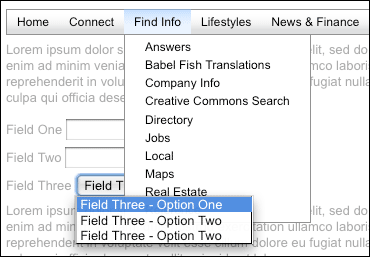 In Safari 3 and IE 6 the
 <select>element's popup menu is modal—making it impossible to interact with any of the other elements on the page, and therefore impossible to both trigger the display of a DHTML menu and impossible for the<select>element's popup menu to potentially poke through a DHTML menu.In all other browsers, a
<select>element's popup menu is both not modal and has a zindex higher than any other element. The established best practice of using an<iframe>element has a shim does not fix the problem. Currently there is no fix for this issue.