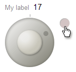 The Dial widget is a circular value input control. It's like a real-world, analog volume control dial, but with much finer UI control.
Have you ever needed a slider with a 2000 unit range, wanted 1 unit accuracy, but didn't have 2000 pixels of real estate for a slider?
The Dial widget is made for cases like this.
The Dial widget is a circular value input control. It's like a real-world, analog volume control dial, but with much finer UI control.
Have you ever needed a slider with a 2000 unit range, wanted 1 unit accuracy, but didn't have 2000 pixels of real estate for a slider?
The Dial widget is made for cases like this.
The user sets the value of the dial by dragging its handle or clicking on the ring.
Getting Started
To include the source files for Dial and its dependencies, first load the YUI seed file if you haven't already loaded it.
<script src="http://yui.yahooapis.com/3.8.0/build/yui/yui-min.js"></script>
Next, create a new YUI instance for your application and populate it with the
modules you need by specifying them as arguments to the YUI().use() method.
YUI will automatically load any dependencies required by the modules you
specify.
<script>
// Create a new YUI instance and populate it with the required modules.
YUI().use('dial', function (Y) {
    // Dial is available and ready for use. Add implementation
    // code here.
});
</script>
For more information on creating YUI instances and on the
use() method, see the
documentation for the YUI Global Object.
Using the Dial Widget
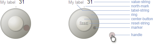
Anatomy of a Dial
Dom Structure
The major parts of the Dial are:
- Ring
- Marker
- User-draggable handle
- Reset button
A label string and a value string are dislayed above the dial.
Like other form controls, Dials are inline elements.
Markup Structure
The final rendered Dial has the markup structure shown below:
<div id="demo">
    <div class="yui3-widget yui3-dial">
        <div class="yui3-dial-content">
            <div class="yui3-dial-label" id="[custom YUI gen id for screen reader]">
                <span class="yui3-dial-label-string">My label</span>
                <span class="yui3-dial-value-string">30</span>
            </div>
            <div class="yui3-dial-ring">
                <div class="yui3-dial-north-mark"></div>
                <div class="yui3-dial-marker yui3-dial-marker-hidden"></div>
                <div class="yui3-dial-center-button">
                    <div class="yui3-dial-reset-str"></div>
                </div>
                <div class="yui3-dial-handle yui3-dd-draggable" title="Drag to set value" tabindex="0" role="slider" aria-valuenow="30" aria-valuemin="-220" aria-valuemax="220" aria-valuetext="30" aria-labelledby="[custom YUI gen id for screen reader]"></div>
            </div>
        </div>
    </div>
</div>
Instantiating the Dial
Note: be sure to add the yui3-skin-sam classname to the
page's <body> element or to a parent element of the widget in order to apply
the default CSS skin. See Understanding Skinning.
<body class="yui3-skin-sam"> <!-- You need this skin class -->
The only markup required to instantiate a Dial is an HTML tag into which the widget will be rendered.
<div id="demo"></div>
Dial extends the Widget class, following the same pattern
as any widget constructor, accepting a configuration object to
set the initial configuration for the widget.
Some commonly used configuration attributes are shown below.
YUI().use('dial', function(Y) {
    var dial = new Y.Dial({
        min:-220,
        max:220,
        stepsPerRevolution:100,
        value: 30,
    });
});
After creating and configuring the new Dial,
Call the render method on your Dial object, passing it
the selector of a container object.
This renders it in the container and makes it usable.
var dial = new Y.Dial();
dial.render("#demo");
Attributes
The following configuration attributes are provided to define default values for each Dial widget:
| Attribute | Description | Default |
|---|---|---|
min |
Minimum input value allowed | -220 |
max |
Maximum input value allowed | 220 |
diameter |
Diameter of the dial control in pixels | 100 |
centerButtonDiameter |
The diameter of the center button. This value is a percentage of the diameter of the Dial widget. | 0.5 |
markerDiameter |
The diameter of the marker that follows the angle of the handle as it is dragged. This value is a percentage of the diameter of the Dial widget. | 0.1 |
handleDiameter |
The diameter of the handle that sets the Dial value. This value is a percentage of the diameter of the Dial widget. | 0.2 |
value |
The initial value which will set the UI display | 0 |
minorStep |
Value is incremented/decremented by this value on arrow key press. | 1 |
majorStep |
Value is incremented/decremented by this value on page up/down key press. | 10 |
stepsPerRevolution |
One revolution of the dial adds/subtracts this many value units. | 100 |
decimalPlaces |
Number of digits to the right of decimal point to retain in the value. | 0 |
strings |
Display text strings are isolated in object literals and are handled through YUI's Internationalization utility. See the examples for ways to replace these strings. | {label:'My label', resetStr:'Reset', tooltipHandle:'Drag to set value'} |
handleDistance |
This is the distance from the center of the dial to the center of the marker and handle when at rest. This value is a percentage of the radius of the Dial widget. | 0.75 |
Setting and Constraining the Dial Value
Setting and Getting Dial Values
Like any input element, the most important thing about a Dial is its value.
value is managed as an attribute.
// Specify value at construction
var dial = new Y.Dial({
    value  : 50
});

// Get and set the value as an attribute
var val = dial.get('value');

dial.set('value',val + 10);
Constraining Dial Values
A Dial's value is constrained between the configured min and max attribute values.
Values outside this range are treated as the closer of min or max.
Configuring values for max and min that are respectively larger or smaller than the configured
stepsPerRevolution or -stepsPerRevolution can be used to configure a Dial to allow the user to drag the handle more than 360°.
By this means, a Dial can be configured to "go around and around," allowing a very large range of values.
YUI().use("dial", function(Y) {

    var dial = new Y.Dial({
        min:-520,
        max:720,
        stepsPerRevolution:100,
        value: 30,
    });
    dial.render("#demo");

});
Sync the UI If the Dial Was Rendered off the DOM
If a Dial is rendered off the DOM, you must call the Dial's syncUI() method after attaching it to the DOM
in order for the handle to be placed correctly.
When off DOM, the dimensional information necessary to place the handle is unavailable.
CSS
The core structural CSS for the Dial is shown below. Widths and heights of elements are computed based on the "diameter" configuration property.
/* VML implementation for IE */
v\:oval,
v\:shadow,
v\:fill {
    behavior: url(#default#VML);
    display: inline-block;
    zoom: 1; *display: inline; /* IE < 8: fake inline-block */
}
.yui3-dial{
    position:relative;
    display:-moz-inline-stack;
    display:inline-block;
    zoom:1;
    *display:inline;
}
.yui3-dial-content,
.yui3-dial-ring{
    position:relative;
}
.yui3-dial-handle,
.yui3-dial-marker,
.yui3-dial-center-button,
.yui3-dial-reset-string,
.yui3-dial-handle-vml,
.yui3-dial-marker-vml,
.yui3-dial-center-button-vml,
.yui3-dial-ring-vml v\:oval,
.yui3-dial-center-button-vml v\:oval
{
    position:absolute;
}
.yui3-dial-center-button-vml v\:oval {
    font-size:1px;
    top:0;
    left:0;
}
.yui3-skin-sam .yui3-dial-hidden {
    opacity:0;
    filter:alpha(opacity=0);
}