 The Calendar widget is a visual representation of a range of dates in blocks of one or more months, which allows the user to select dates and navigate the date range.
In addition to the core logic for displaying a date range and allowing date selection and navigation, Calendar also provides options for custom date filtering, custom formatting of individual dates, various display options, internationalization, flexible templates, additional navigation plugins, and more.
Calendar is highly modular and easy to extend so that it can be modified or used as the basis for custom implementations and widgets.
Getting Started
To include the source files for Calendar and its dependencies, first load the YUI seed file if you haven't already loaded it.
<script src="http://yui.yahooapis.com/3.8.0/build/yui/yui-min.js"></script>
Next, create a new YUI instance for your application and populate it with the
modules you need by specifying them as arguments to the YUI().use() method.
YUI will automatically load any dependencies required by the modules you
specify.
<script>
// Create a new YUI instance and populate it with the required modules.
YUI().use('calendar', function (Y) {
    // Calendar is available and ready for use. Add implementation
    // code here.
});
</script>
For more information on creating YUI instances and on the
use() method, see the
documentation for the YUI Global Object.
Using Calendar
Quick Start
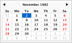
Here's an easy way to create an instance of a Calendar with just a few lines of code.
HTML
Note: be sure to add the yui3-skin-sam classname to the
page's <body> element or to a parent element of the widget in order to apply
the default CSS skin. See Understanding Skinning.
<body class="yui3-skin-sam"> <!-- You need this skin class -->
JavaScript
YUI().use('calendar', function (Y) {

  // Create a new instance of Calendar, setting its width
  // and height, allowing the dates from the previous
  // and next month to be visible and setting the initial
  // date to be November, 1982.
  var calendar = new Y.Calendar({
          contentBox: "#mycalendar",
          height:'200px',
          width:'600px',
          showPrevMonth: true,
          showNextMonth: true,
          date: new Date(1982,11,1)}).render();

});
For a more complete discussion of how to use, configure, and customize Calendar, read on.
Configuring Calendar
Except for contentBox, all configuration attributes are optional. This list only contains the most interesting attributes. For a complete list of all attributes, please refer to the API docs.
CalendarBase Config Attributes
These attributes are provided by CalendarBase, which is the core foundation for the Calendar widget. They are available on all Calendar instances.
| Attribute | Default | Description |
|---|---|---|
width |
300px |
The width of the calendar widget. |
height |
200px |
The height of the calendar widget. |
date |
Today's date on the user's system | The date corresponding to the month and the year to be displayed. The date assigned to this attribute will always be normalized to the noon on the first of the month. In a multi-pane calendar, the month and the year of the first pane will correspond to this date. |
customRenderer |
null |
An object containing a rules attribute and a filterFunction attribute. See the Custom Rendering section for details on how these attributes work.
|
showPrevMonth |
false |
Whether the dates from the previous month should be shown in the empty cells of the month grid before the first of the month (if there are any). |
showNextMonth |
false |
Whether the dates from the next month should be shown in the empty cells of the month grid after the last of the month (if there are any). |
headerRenderer |
"%B %Y" |
The formatting for the header of the Calendar. This attribute can be either a String with the formatting tokens used by the strftime specification, or a callback function that will receive a Date object as an argument and output a String.
|
Calendar Config Attributes
These attributes are provided by Calendar, which is the complete implementation of Calendar widget that includes user interactivity (navigation and selection). They are available on all instances of Calendar.
| Attribute | Default | Description |
|---|---|---|
selectionMode |
single |
The configuration for the type of date selection allowed by the calendar. The selectionMode can be either "single", "multiple" or "multiple-sticky".
|
minimumDate |
null |
Specification for the earliest month which the Calendar will display. In a multi-pane calendar, this is the earliest month that will appear in the first pane. |
maximumDate |
null |
Specification for the latest month which the Calendar will display. In a multi-pane calendar, this is the latest month that will appear in the last pane. |
enabledDatesRule |
null |
The name of the rule that should be matched by enabled dates. If specified, a customRenderer definition is required (see Custom Rendering for more information). Only dates matching the rule will be enabled for interaction; all other dates will be disabled. Cannot be specified simultaneously with the disabledDatesRule attribute.
|
disabledDatesRule |
null |
The name of the rule that should be matched by disabled dates. If specified, a customRenderer definition is required (see Custom Rendering for more information). Only dates not matching the rule will be enabled for interaction; all other dates will be disabled. Cannot be specified simultaneously with the enabledDatesRule attribute.
|
Custom Rendering
Calendar allows the developer to customize the rendering of individual cells based on a set of rules that match
specific dates. To create a set of custom rules and a custom renderer function that is triggered when a rule is matched, set the customRenderer property to an Object with two keys: rules and filterFunction:
calendar.set("customRenderer", {rules: myRules,
                                filterFunction: myFilterFunction});
Rendering Rules
The rules parameter looks as follows:
var rules = {
"2011,2013,2015-2019,2017": {
  "0,1,5-7": {
    "5,6,8": {
      "all": "rule_name"
      }
    }
  }
};
At the top level, the rules object specifies years that dates should match; the next level is months (indexed starting at 0), the next is days of the month (indexed starting at 1), and the last is days of the week (indexed from Sunday, starting at 0). The actual value is the name of the rule that is matched by a date. In the example above, the rule "rule_name" is matched by the 5th, 6th and 8th days of January, February, June, July and August of 2011, 2013, 2015 through 2019, and 2017.
Note that the keyword 'all' can appear at any level of the rule object and will match all parameters (e.g. all years, or all months) at that level. Furthermore, the rule name value can also appear at any level, for instance:
var rules = {
"2011": {
  "5-7": "summer-2011"
  }
};
The rule 'summer-2011' corresponds to June through August of 2011. More than one rule can be specified in the same rules object:
var rules = {
"2011": {
  "5-7": "summer-2011"
  },
"2012":
  {
   "all": {
      "all": {
        "0,6": "all-weekends-in-2012"
      }
   }
  }
};
Custom Rendering Function
In order to match these rules, the customRenderer allows the developer to provide a filterFunction that will get called every time one or more rules is matched. The filterFunction has the following signature:
filterFunction = function (date /*Date*/, node /*Node*/, rules /*Array*/) {
  if (rules.indexOf("rule_name") >= 0) {

  }
};
The first parameter, date, is a single date that matched one or more rules. The second parameter, node, is the Node wrapping the DOM element corresponding to the given date. Finally, the third parameter, rules, is an
Array of Strings, each containing a rule name that the given date matched.
As an example, here is a custom renderer that assigns a custom CSS class to all summer weekends:
var rules = {
  "all": {
    "5-7": {
      "all": {
        "0,6": "all-summer-weekends"
      }
    }
  }
};

var filterFunction = function (date, node, rules) {
  if (rules.indexOf("all-summer-weekends" >= 0)) {
    node.addClass("customCSSClass");
  }
}

calendar.set("customRenderer", {rules: rules, filterFunction: filterFunction});
Enabling and Disabling Dates
In addition to custom rendering, the rules can also be used to specify sets of dates that should be enabled or disabled for selection. To do that, specify a rule set as described above, and then specify which rule should be used to match either the disabled dates, or the enabled dates (but not both: only one of the two parameters will be honored):
calendar.set("disabledDatesRule", "someRuleName");
// OR
calendar.set("enabledDatesRule", "someRuleName");
Note, by the way, that the same rule name can be listed multiple times, giving the developer a lot of flexibility in defining what set of dates can be matched. For example, the following rule set matches all weekends and the 10th of every month:
var rules = {
  "all": {
    "all": {
      "all": {
        "0,6": "all-summer-weekends"
      },
      "10": "10th-of-every-month"
    }
  }
};
Calendar Templates
By default, the calendar is rendered using a set of templates, specified as static properties of the CalendarBase class. These templates can be completely modified to reconfigure the markup of the calendar, as long as the tokens they use as placeholders for CSS classes, ids and content are preserved.
Using the template logic, the developer can easily switch from a single pane calendar, to a calendar with
an arbitrary number of panes. Consider the main CONTENT_TEMPLATE in CalendarBase:
CONTENT_TEMPLATE:  '<div class="yui3-g {calendar_pane_class}" id="{calendar_id}">' +
                            '{header_template}' +
                          '<div class="yui3-u-1">' +
                            '{calendar_grid_template}' +
                          '</div>' +
               '</div>'
In this template, the {calendar_grid_template} is a so-called iterative token -- that means it can be used
multiple times, and the calendar will automatically adjust to generate multiple sequential month grids for the
calendar
For convenience, we provide a two-pane and a three-pane calendar templates. Here is the two-pane template:
TWO_PANE_TEMPLATE:
    '<div class="yui3-g {calendar_pane_class}" id="{calendar_id}">' +
                 '{header_template}' +
               '<div class="yui3-u-1-2">'+
                       '<div class = "{calendar_left_grid_class}">' +
                    '{calendar_grid_template}' +
                       '</div>' +
               '</div>' +
               '<div class="yui3-u-1-2">' +
                       '<div class = "{calendar_right_grid_class}">' +
                    '{calendar_grid_template}' +
                       '</div>' +
               '</div>' +
    '</div>'
Switching to the two-pane template is as simple as assigning the value of CalendarBase.CONTENT_TEMPLATE:
CalendarBase.CONTENT_TEMPLATE = CalendarBase.TWO_PANE_TEMPLATE;Custom templates may also be constructed, with as many
{calendar_grid_template} tokens as necessary.
Calendar Plugins
The Calendar ships with a default CalendarNavigator plugin, which adds the
simple navigation controls to the top of the widget. The plugin is located on the navigator namespace (that is, to access it and its properties, you would reference mycalendar.navigator). For future releases, more complex calendar navigation plugins
are planned.
In addition, in future releases, Calendar will also have a Popup plugin that will allow it to be easily hidden, shown, and associated with other UI elements.
Known Issues
-
The calendar is currently not enabled with popup functionality.